

Website Content Guidelines
On average users look at your webpage for only 10-20 seconds.
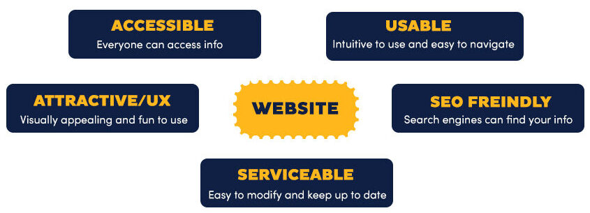
Create easy-to-scan pages with simple clear text and easy to identify links. This improves usability, accessibility and Search Engine Optimization (SEO).
Every word that is not needed should be deleted.
Avoid Welcome Messages
- “Welcome to our website, our program, etc …”
- “We invite you to look … “
Everyone by default is welcome!
Important Information First
- State conclusion or purpose or most important info first. Users may never get to the bottom of the page.
- Answer the who, what, when, where, why questions as soon as you can. Don’t build up to it.
Simple Words and Tenses
Clear Descriptive Headings and Subheadings (h1,h2,h3)
Headings indicate to screen readers, search engines, and regular users, the key topics on your pages. Proper use of headings is good for accessibility and SEO.
- Use headings to structure content.
- Do not just make text big and bold to “look” like a heading.
- Do not use headings to make text “look” large or small.
- Do not skip headings levels.
- Make headings interesting.
- Use passive voice if it makes sense.
- Use questions in headings.
Short Sentences and Paragraphs
- Make your point quickly. Usually not more than 20 words per sentence.
- Short concise paragraphs.
- Shorter than for printed material.
- Not more than five sentences per paragraph.
- One-sentence paragraphs are OK.
Chunking Content – The Importance of Formatting
Pronouns and Active Voice (with the exception of headings)
- Use “you” and “we”: This makes for a shorter cleaner sentence.
- Use active voice. It is usually shorter and easier to read.
- “The handbook should be downloaded by the student before…” in active voice “You should download the handbook before …” or simply, “Download the handbook before..”
- “The following framework was proposed by the committee.” in active voice “The committee proposed the following framework.”
Links
Links labels should be clear, descriptive, and easy to understand. A clear label is easier to All users, especially screen reader users. It also improves SEO.
A user should know what will happen or where they will go BEFORE they click on a link!
- Click here is not a good link label. Instead of ” Click here to download the student handbook”, write “Download the student handbook”.
- Users should know in advance what happens when they click on the link.
- If the link opens a PDF or anything other than an HTML page, inform the user.
Write Strategic Plan (PDF) instead of Strategic Plan.
On a mobile device, for example, a user may not want to wait for a PDF to load. - Email links should be clear. For example: jane_smith@uncg.edu rather than Jane Smith. In the second case, it is not clearly an email link.
It is frustrating to click and inadvertently open an email program that you do not use.
- If the link opens a PDF or anything other than an HTML page, inform the user.
- Don’t embed important links in the middle of dense paragraphs. Put them in a menu or sidebar.
- If you never see or read the link you will not click on it.
- Labels should be as short as possible.
- Don’t user urls as link labels : https://hhs-sites.uncg.edu/people?role=faculty – unless the URL is memorable like Iforgot.apple.com.
- Don’t open links in a new window.
- For mobile devices and screen readers this may be confusing. Some people may not realize a new window or tab has opened – when they try the back-button it does not work, as the new window or tab has no history. Everyone knows about the back button.
File Names
Consistent human and machine readable and sensible file names. It is easier to find the image or document in a Google search. It is also easier for you to find your document in 2 years from now when you have forgotten what you called it!
- Examples of file names:
- Do not use spaces in file name – in a browser address bar the space is converted to “%20” so the file name “easy to read.docx” renders as “easy%20to%20read.docx”
- Use dashes or underscores to separate words.
- Do not use punctuation in files names. syllabus
- Be consistent and descriptive. If your files have versions it may be useful to have dates. For example: phe-112-02-syllabus-fall-2021.pdf
Multimedia
Images
- Do not upload an image directly from a camera and then resize with the image handles in WP. It might “look” the right size, but the actual file size has not changed.
- Use alt text for images, unless the images are purely decorative.
- Do not say “Image of …” in alt text. Alt text is read out by screen readers and it is frustrating to hear “image of ” 10 times, when the user knows the object is an image.
- Alt text should convey the meaning, not just describe the image. For example: If you have an image of a magnifying glass to indicate search, the alt text ‘search’ is more meaningful than ‘magnifying glass’.
- Provide a text version if you use an infographic.
- Note that contact info, email addresses, and urls in your graphic cannot be cut and paste and screen readers cannot “read” pixels.
- Check for adequate contrast between foreground and background. See WebAim contrast checker.
Video
- Use YouTube.
- Use captioning – always.
- YouTube automatic captioning is the easiest.
- Edit the captions to add punctuation and correct errors.
- Allow controls to display so user can start and stop video. This is the default when you embed a YouTube video in a webpage – do not change that if given the option.
- Video should be short! With few exceptions, no longer than 30-60 seconds.
Audio
- Include a text transcript.
References
- UNCG BrandGuide
- Be sure to use the correct colors/fonts/logos
- Accessibility
- Writing for the web – Neilson Group.
- plainlanguage.gov